CINCH / DOMAINE ALTERNATIVES
Three free alternatives.
Domaine Sans Display is the reference. These candidates explore its stroke contrast, curves, and proportions. All three free fonts are rendered as live text, with full-page previews.
The reference uses the foundry-rendered image from the previous study. Each free font is self-hosted with its SIL Open Font License. The selected site typeface is Momo Trust Display.
Domaine Sans Display
Regular · paid reference
The reference: fine hairlines, broad curves, and substantial vertical strokes. The free options below are compared against this exact headline.
 THE CINCH PROGRAMMING LANGUAGE
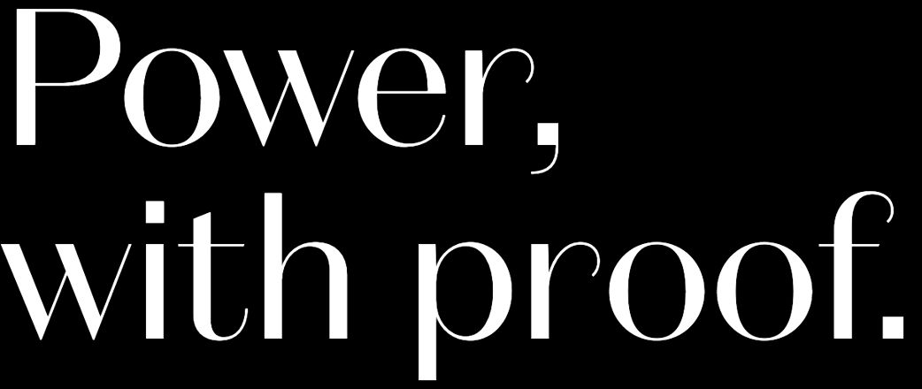
Dependent types.
Explicit effects. Resource control.

Italiana
Regular · SIL Open Font License
Fine hairlines and strong vertical contrast. Its narrower, lighter forms capture some of the delicate appearance of the Domaine reference.
THE CINCH PROGRAMMING LANGUAGEwith proof.
Dependent types.
Explicit effects. Resource control.
Belleza
Regular · SIL Open Font License
A high-contrast humanist sans with classical proportions. It is closer to Domaine’s sans-serif construction, with heavier fine strokes and a less dramatic contrast.
THE CINCH PROGRAMMING LANGUAGEwith proof.
Dependent types.
Explicit effects. Resource control.
Antic Didone
Regular · SIL Open Font License
Small, ornate serifs, a large x-height, and narrower forms. A softer alternative if Italiana feels too stark.
THE CINCH PROGRAMMING LANGUAGEwith proof.
Dependent types.
Explicit effects. Resource control.