CINCH / TYPE STUDY
Five headline options.
The same words, artwork, and supporting type in each sample. Only the headline changes. The selected site typeface is Momo Trust Display.
The three open-source options render as live text. The two paid samples are screenshots of this headline in Klim’s own type tester. No commercial font files are embedded. Klim offers test webfonts after email and licence acceptance.
Archivo
Bold
A heavier, workmanlike sans. The compact shapes give the headline more weight next to the fox.
The straightforward sans option.
Open source · SIL OFL
 THE CINCH PROGRAMMING LANGUAGE
with proof.
Dependent types.
Explicit effects. Resource control.

Newsreader
Display Medium · optical size 72
A newspaper-style serif with a flowing lowercase. It brings out the gold wordmark’s editorial side.
My first free choice for Cinch.
Open source · SIL OFL
THE CINCH PROGRAMMING LANGUAGEwith proof.
Dependent types.
Explicit effects. Resource control.
Grenze
Semibold
Angular, cut-looking strokes and sturdy serifs. The most unusual option here; it echoes the pointed ears and fur in the artwork.
The more eccentric choice.
Open source · SIL OFL
THE CINCH PROGRAMMING LANGUAGEwith proof.
Dependent types.
Explicit effects. Resource control.
Domaine Sans Display
Regular · Klim Type Foundry
Strong stroke contrast in a sans face. The shapes feel sculpted, which suits the dimensional wordmark.
My first paid choice for Cinch.
Paid · official tester capture
THE CINCH PROGRAMMING LANGUAGE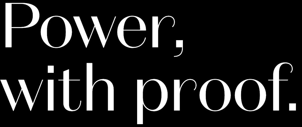
Dependent types.
Explicit effects. Resource control.
Founders Grotesk
Medium · Klim Type Foundry
Compact, tightly spaced grotesk forms. A quieter alternative to the serif options, with more print character than the current face.
The restrained paid option.
Paid · official tester capture
THE CINCH PROGRAMMING LANGUAGE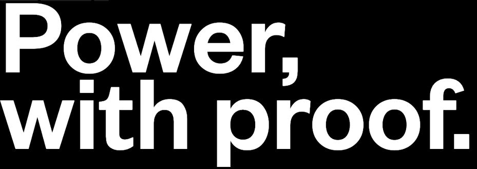
Dependent types.
Explicit effects. Resource control.